Sunday, 14 May 2017

PPP / Module Evaluation

PPP is a module that is highly beneficial in terms of gaining knowledge and experience within industry. Additionally it is an opportunity to reflect on how you want to communicate yourself as a designer, for potential clients and work opportunities, through self identity. 

During PPP this year I have gained a wider knowledge of the industry, through completing two internships over the course of the module. Both of these placements provided a different learning experience through their professional approaches. Rabbit Hole was an extremely professional and quiet setting, offering me experience within the industry and about my craft. I worked on a project for a week, and in this time I felt I learned a lot about creating professional and tight work, with software advice, industry advice and tips for extra resources to read. In Bradford at Everyday Something, there was definitely a different atmosphere, whilst more relaxed, there was still a sense of professionalism established within the studio. Here, I worked on a number of projects which furthered multiple skills as a designer such as working with video, analogue techniques and also completing live work for large companies such as Oakley. 

Completing collaborative tasks this year within PPP was refreshing but also gave me an insight to how I like to approach a brief, and sometimes this was not reflected within the group work. Experience with collaboration gives the designer the tools to work even more efficiently next time, and ensure the dynamic of the group work is effective in terms of producing good quality work. 

Out of university I have attended multiple talks and creative events such as the Intern careers evening which gave me advice for starting a magazine in the future, from Alec Dudson, an aspiration of mine for after university. 


Overall I feel I have learned a lot about myself as a person and who I am as a creative within the industry this year. I feel I have gained the most experience this year than previously in levels 5 and 6, by contacting multiple studios within the UK and also within Berlin. By establishing that this is a location I am interested in working in the future, it is important to make yourself known now, which is what I will be doing after university and in the future. 

PPP / WIP Portfolio

It's always important to have a portfolio with examples of your work for potential clients and studios to look at concisely and efficiently. For this years PPP module submission, I have produced a small promotional pack with 'teasers' of my work, but for future client/work opportunities, I have began to produce my main portfolio with CV and examples of my best work. It's still a work in progress but you can see the basis of what will be created after this year's deadlines.


Wednesday, 10 May 2017

PPP / Promotional Pack

Last year I produced a promotional pack which I felt was successful due to its consistency and professionality (experimentation with stock, etc).


Development:

Keeping it simple, as it's a teaser/mini portfolio which does not need extensive explanation for each project. Maximum of 3 projects within the booklet. Keeps to the consistent self branding guidelines.


Production


The promotional pack this year follows the same reflective aesthetic as the business cards, adding continuity across the deliverables. The reflective surface represents seeing yourself in a mirror, and staying true to yourself, crucial to my own practice and life motto. 


The pack contains CV, mini portfolio & business card, in a bubbled envelope for decoration and protection.  These can be sent off to studios, as it is a bit more interactive than just sending an email, and may result in them remembering me more.   

Monday, 8 May 2017

PPP / Self Branding / Final Business Cards


The logo is sandblasted onto the front of the business cards, and on the back the information is cut out of black vinyl, which is durable and easy to read. 

Overall I'm extremely proud of how these look, and feel they really communicate my style and process as a designer. I want to create more adventurous resolutions such as this in the future and thoroughly enjoyed experimenting with vinyl and sandblasting. 


Thursday, 4 May 2017

PPP / Self Branding / Brand Extension


To further push my identity and allow it to be recognised across my final projects, I have incorporated it into a selection of my briefs for extended practice. Since I concentrate mainly on editorial work, the logo is usually printed on the back cover as my 'signature'. This is an example of how to extend my brand and get my logo recognised.


Monday, 1 May 2017

PPP / Self Branding / Pushing My Brand

Since I have chosen to create business cards out of metal, I feel this should now be pushed onto the rest of the brand’s identity such as promotional pack. It is not feasible to use metal on a promotional pack, as it would be too rigid and could take too much of my current time trying to figure out how to utilise the material. To solve this, I will use materials which mimic the metal treatment, such as reflective stock or vinyl. In the print room there is vinyl which has a very similar appearance to the aluminium used on my business cards, which should be perfect to use and continue the brand on any promotional material such as CV/Portfolio preview booklet/prints. As for any packaging to send out the promo pack, last year I used a company which supply bubbled envelops in which you can buy in many different colours and finishes. They stock a very reflective metallic finish which could be perfect, but I should request a sample to ensure it’s correct. 


I also picked up some reflective wrapping paper to test out if that is effective. Firstly, the design must be created keeping these materials in mind. 

Saturday, 29 April 2017

PPP / Talk / Raw

Rob Watson from Raw came into the studio to talk about the studio and his experiences as a designer. This talk was by far my favourite this year, as he articulated himself well and I think I related to the quotes and ethos within the presentation. Raw are all about doing things your way, and not worrying about going down the path that has been made for you. I found listening to the experiences very inspiring for my own future, and afterwards I talked to Rob about my current projects including Demon Magazine and my Ceramics brief, which he really liked. It was good to get a new perspective on briefs I'd been looking at for months, and to take on board what he thought about where the project had been going.

PPP / Self Branding / Business Cards / Sandblasting

I printed the vinyl design and began to peel the letterforms and icon out of the vinyl. This was extremely challenging because of the font size, and the counters easily peeled out along with the letterform. After several excrutiatingly annoying minutes, I concluded that this may not work for sandblasting especially with the counters. I decided to take it easy and not rush this, and just sandblast the icon for now until I can work out how to fix the issue for the type.

I covered the backs of the business cards with tape, and applied the vinyl to the front, which was then sandblasted. The result was perfect and I was very pleased with them.


Solutions for the back of the card:

- Make text size bigger and re attempt
- Just apply the type with vinyl and experiment with colours and finishes?

Friday, 28 April 2017

PPP / LIFT Publication Cover

I was approached by level 6 Photography student Beth Sonnenthal to design a front cover for her photography publication featuring women who powerlift, titled LIFT. She wanted a minimal cover just using type, so I took this as a nice opportunity to do a quick brief, and I liked the theme of the project.

Beth was open to any ideas and just wanted a heavy typeface and a design that would make the publication stand out.

Beth liked the idea of adding weights to the type but wasn't sure it would suit her photography. Instead she really liked the condensed typeface because of its humanistic structures and connotations of power and 'lifting'. The forms are elongated, to represent those in the publication achieving goals and lifting weights upwards.


In the end Beth's preferences where the pink and orange versions which I sent for her to use on her project. This brief was fast and helped me develop communication with clients on something fast and straightforward.

Saturday, 15 April 2017

Rabbit Hole / A2 Artwork / Developments & Final Artwork


Using hand rendered techniques with the phrase 'love is love', however this isn't communicated through the imagery enough. I wanted to draw similarities and a reminder of the awful history that the holocaust was, since concentration camps are being used again in Russia. I combined the image found on news sites about the Chechnya camps, and imagery I took in Auschwitz of the barbed wire in the camp. 


This text reads 'remember their history'. 


More experiments with compositions. Added the Russian crest for more context. Keeping to the same colours of the flag.

I felt there needed to be an indication of the links between sexuality and Russia, which could help the audience understand what the poster is about more, as currently it looks a little ambiguous. 


I liked where this was going now, so I asked Rhys what he thought the poster was about, and he got it correct, so this was a good indication that someone who has no idea about the idea can grasp what it's about. 

Now I refined it.


Pink softens the harsh context and imagery, allows the flag to stand out. Desaturated the flag to work more suitably with the colour choices. Added Putin for mysterious effect and context. 


This will now be sent to Martyn @ Rabbit Hole. 

Rabbit Hole / A2 Artwork / Initial ideas


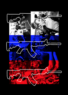
Using imagery of guns to create an authoritarian tone, layered with images of people being apprehended or attacked at LGBTQ+ rallies. Utilising colours of Russian flag for context. Doesn't really make much sense in terms of sending a message against this behaviour. 


'Equality for Russia' overlayed on an image of a man with a bleeding nose, shows pain that Russian people face. 


Using texture and the simple word 'Equality' with same colour system. Not dynamic enough, needs another element such as image or treatment to the text.


Using imagery, experimenting with text positioning and layering to create magnified effect to represent volume and depth, avoiding the text looking too flat alongside textured imagery. 

Feedback concluded that it may not be obvious enough what the word is representing, and to try and use the colours vertically to represent the Russian flag further. 


Thursday, 13 April 2017

Rabbit Hole / A2 Artwork / Brainstorming


I began to brainstorm ideas. The first two stem from a brief I was going to complete for extended practice but was not able to due to time, and it includes collating pictures of objects on the street that you wonder how it ended up there, like one glove...a sock etc. The concept would surround the idea of being discarded or lost.

The second two concepts come from areas which have bothered me in the past/still do:

Women and Youtube/Social media

You can't get away from misogynistic comments all over youtube especially I have noticed. On women's videos, a lot of people comment on the appearance, their bodies, and I've seen a lot of blatant rape culture. This idea could be to collect real life comments which really highlight blatant sexism behind the mask that is the internet.


Russia's Homophobia

In recent news it has came about that in Chechnya, Russia, LGBTQ+ individuals have been gathered and put in concentration camps. In 2017. A subject I am very passionate about could create a good piece of work with a good meaning.


Thursday, 6 April 2017

PPP / Self Branding / Metal Business Cards


The business cards are cut to 85x55mm size, and are made from 1mm aluminium. Aluminium is lighter than other metals. This was the main reasoning for choosing this material as for a business card of this nature it needed to be as light as possible when put away in someones bag or pocket, and in their hands. 

Now the design needs to be sandblasted onto the cards double sided. Altogether I have cut 13 business cards. Once the laser cutting is done and the design is ready to be sanded, it should be fairly simple and quick to do.


PPP / Self Branding / Metal Business Cards

For my business cards this year I wanted to use a different material than just paper. The idea I came up with was using metal. The concept behind using metal for my business cards is that it's strong, lasting and will leave an impression, hopefully just like I will as a designer. It's much more likely to get people talking and would be easier to hold onto rather than lose in a bag or a pocket. 

Limitations

May be heavy and could be sharp around the edges 
Can't just print design onto it simply


Positives

Looks interesting!
Doesn't rip or decompose / can handle pressure
Leaves a lasting impression
Different 
Conceptual 


I knew that I wanted to somehow get my design onto the cards but wasn't sure how, but assumed it could be engraved. I headed down to the metal workshop to discuss this idea further. They were not able to do engraving down there, but I was advised that I will need to source the metal, cut it to size firstly, and then the best way to get the design onto the card will be to sandblast each one. To do this I need to buy etch resist vinyl and lasercut the design, then pick out the parts I want to be sandblasted, the covered section will not be touched.


The business cards will be standard size 85x55mm and made from 1mm aluminum sheets. 

Monday, 3 April 2017

PPP / Self Branding / Unique Business Cards

This year I have set myself the task of creating a unique business card that does not use the normal methods, i.e laser printer and thick gsm. I wanted to create something conceptual to my own identity, but also something that looks engaging and more unique. I began to try and find examples of business cards that have thought outside the box, and produced something out of the usual through materials and print methods.


Research into bespoke business cards gave an insight into how different materials can be applied to create a resolution that stands out and gets noticed. Materials can give this effect such as glass/perspex or neon plastics; or, the format in which the cards are created, for example as a ticket as seen above. 

Interning / Report


Intern Report

The report serves as a collective piece of data recording my experiences at both of my internships over the course of this last academic year, showcasing the work I produced at each one. This allowed me to reflect on what I've learned, and produce a concise piece of design to follow. For Rabbit Hole, since it was a week long brief, I explained what I did every day, whereas Everyday Something I broke into briefs that I completed instead.

Everyday Something / Further Internship

I did a 2 week long internship at Everyday Something, and shortly after completing my time there I recieved an email from James asking if a 3 month long internship after finishing the course would be something I'm interested in. What I like about Everyday Something is that the work is paid, and interns are respected, which is an incentive to go back there for more experience. However during Summer it would be incredibly hard to work in Bradford from where I live. I asked whether working from home would be an option. James was clear that he wanted to work something out but the decision is not final yet.


Everyday Something / More Videos

James asked if I'd like to do more work (paid), and create more Simpsons videos for 3 other products. This would include 3 full length videos similar to the one I made during my internship. I accepted and will send these over during the first week of the Easter break, ensuring I plan my time well around extended practice.


Internship 02 / Everyday Something / Simpsons Videos

Since James owns a shop with products that feature pop culture references, he suggested I create a video to help promote their 'Steamed Hams' simpsons tshirt. He liked the way I produced my Holy Water advert for COP, and wanted this to be a source of inspiration. The brief suggested using disorted footage, chopped up and changed and to have an overall 'creepy' and eerie vibe.

I spent a few days on this during the last week of my internship, and overall created a full length video, and four short 'meme'-like videos to produce a reaction from their consumers and get people asking questions and interacting with their pages/products.


Full length


Short clips


Short 1 from Lo Wilcock on Vimeo.
Short 2 from Lo Wilcock on Vimeo.
Short 4 from Lo Wilcock on Vimeo.
Short 3 from Lo Wilcock on Vimeo.

Rabbit Hole / A2 Artwork

A few weeks after my internship at Rabbit Hole, I received another email from Martyn who asked for some high res images of the work I had produced whilst I was there, and also whether I was interested in creating a piece of artwork for their studio; as they are producing a website and publication of their intern's work.

I thought this was a great opportunity to be creative with a lot of freedom, as the piece can be anything, as long as it is A2. Also a nice break from extended practice briefs.


DBA / Presentation


Unfortunately our team was not selected as the winner for the brief but we got some great feedback. The judges liked how the brand had a character and a story, but suggested we should have pushed this even more and had a more dynamic presentation.